The Psychology Of Colour In Web Design
Policyholders charge more for red cars than white cars, urban legend, or reality? What’s true in this affirmation? The psychology of colour can help us understand it.
It has been studied that colours affect the behaviour of human beings and that depending on the type of colour, the energy will be stronger or weaker, just as we know that classical music is not the same as rock music.
Colours surround our whole life; warm, cold, dark, light. We are constantly being targeted by applications or websites that want to reach us using the correct ranges framed in emotion, but what is the correct colour for your marketing strategy?
Colour trends
In any design that is going to be carried out, several factors must be considered, but one of them is important to be in line with current trends. We must not confuse trends and fashion. We can summarize that the trend lengthens in time and has a more gradual boom, while a fashion arrives abruptly and lasts for a shorter time.
Trends help us to know what users’ tastes are and where our design should go if we want to impact our product using the psychology of colour. The current trend is to leave blank spaces so as not to reload your colour website, and the user can correctly read all the content you offer; let’s not look at those flies flying.
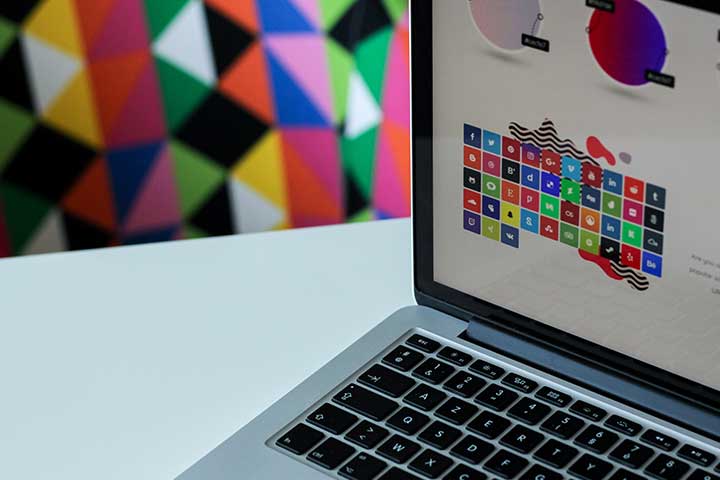
How many colours should our design have?
Less is more; this is becoming a maxim in our society of vertigo and madness. We understand that not all stimuli are essential and that what works is to focus the shot. We need our design to be eye-catching but not over the top to focus on the content.
The best thing is to create a colour palette where we combine at most 4 colours and thus apply them to the entire design set, be it web or advertising. It is important to try with the chosen palette, and otherwise, we like to be able to change it so that the joint is as attractive as possible for the user’s eyes.
This colour palette will mark your actions and personality in the future; take your time to choose it; there is no rush.
Colour theory
It is one of the principles we work on in design and art in general. We follow a set of rules to mix and match the colours when we want to have a goal.
The precursor of the theory of colour was Johann Wolfgang von Goethe, who proposed a basis for the theory of colour on which different authors would later add their findings.
Colour types
We have 3 kinds of colours:
- Primary colours: These cannot be created by combining other colours. They are red, yellow and blue.
- Secondary colours: Secondary colours are formed by combining two of the three primary colours. We have 3 possible combinations, and the colours orange, purple and green come out.
- Tertiary colours: Tertiary colours arise when you mix a primary colour with a secondary colour. The colours are magenta, vermilion, violet, turquoise, amber, and Carthusian.
Achromatic range opens in which we play with tones and shades from these colours.
Colours and emotions
- Red: passion, energy, strength, revolution. You know that nothing is going to a standstill with the colour red.
- Yellow: joy, happiness, optimism, visionary. Fun within reach of one colour.
- Blue: calm, honesty, harmony, security, intelligence. They are calm waters.
- Orange: accessibility, creativity, enthusiasm, adventure. It is a colour that pushes the movement but without leaving the lane.
- Purple: feminine, serenity, elegance, imaginative, nostalgic. Colour to go deeper with.
- Green: careful, fresh, nature, youth, hope. It is a colour that helps you breathe.
- Black: power, formality, sobriety, luxury, sophistication. They have thought twice before getting it wrong.
- White: purity, cleanliness, freshness, tranquillity. You know that you are in a safe environment.
- Grey: peace and simplicity. Between two glasses of water. It is a complex colour to describe.
Also Read: How To Choose Colours For A Web Page